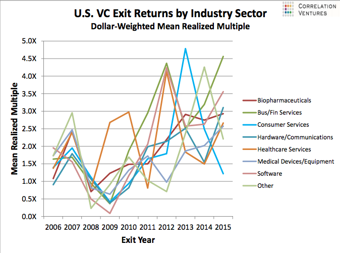
Readers of this blog know that I love sharing data from Correlation Ventures (they have a pretty extensive database of venture deals and venture outcomes and love to post share trends from time to time) – see two great examples using their data here and here from this blog.
A few weeks ago they sent around the chart below which I thought was interesting to share. I’m not surprised at the non-pattern here – as an industry venture is very stochastic. Venture returns are all over the map, really underscoring the need to time diversify venture investing and venture exiting, to the extent to which the latter can be controlled (this graph doesn’t show the date of initial investment, which would be a great new cut at the data – I’ve asked Correlation if they could re-run the analysis that way and will post it if I can get it). Also interesting to note the blip of “Consumer” in 2013 as well as what appears to be a bit of a countercyclical trend in healthcare. Sometimes there are interesting tidbits to be taken from seemingly chaotic data.
